Composition
©Geoff Lawrence
Placing the elements of your picture within the frame and deciding what
to leave out.
 |
|
In our modern world of automatic cameras, which focus for us and
adjust the exposure in an ever more perfect way (most of the time), the
biggest difference between a good photograph and a mediocre one is the
compositon.
In every photograph we take, we can decide where the boundaries of that
photo will be, called the cropping. We can also choose the viewpoint. If
we are taking pictures of people or movable objects then, often, we also
have the opportunity to arrange them into the shapes we want. |
If you are shooting landscapes or other immovable objects then you must
compose the picture by moving yourself and deciding where to place the
point(s) of interest in your picture.
There are various compositional rules (I prefer to think of them as
guidelines) to help you. These rules will help you to compose pleasing
pictures, however, you will often find that a really striking picture will
show a blatant disregard for the rules. Once you are aware of the rules then
break them as often as you want but, at least, know you are breaking them
and why.
Rule of Thirds
Landscape photographers are particularly fond of this one, but it works
well for many types of subjects. The rule of thirds simply says that,
instead of placing the main focus of interest in the centre of the frame,
which gets a little boring, that you look to position it on an intersection
of the thirds. That is to say one third up and one third in or two thirds up
and one third in etc.
Here's a 'thirdsy' sort of picture, hold your mouse over the picture
to see the grid. Placing the boat near the top of the picture tells the
viewer that what they are supposed to be looking at is the reflection.
We could take the boat out altogether, of course, this would focus our
attention even more on the reflection but the picture might then be a
little too minimalist.
Also the mast is almost exactly on the 'third' line. There is a little
space to the right of the bow of the boat which helps to give the
impression that, although the boat is not moving, it has somewhere to
go.
Although a nice illustration of composing 'on the thirds' this picture
falls foul of another 'rule' in that it has very light corners,
especially at the top right and, coupled with the yellow stripe, the
effect is to lead the viewer's eye out of the picture. We'll talk about
this more later.
|
|
 |
 |
|
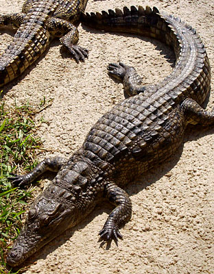
Using Diagonals
Setting your subject matter on a diagonal will almost always make for
a more dynamic picture. Even if this is an invisible diagonal that draws
your eye between two points. Move around the subject (not too close in
the case of my crocodiles) and look for a diagonal.

|
Cropping
What to leave out, what to put in and where to put it.
Tip - One of the easiest ways to improve your photography is with careful
attention to framing. Look into the corners of the viewfinder to see what is
there. Do you need all that background? Can you get closer to your subject
or zoom in? Would the picture look better as an upright or landscape?
 |
|
The most common mistake people make when taking pictures is not
filling the frame with the subject. If it's a photo of granny waving
from the doorstep, let's just see granny and the door, not half the
houses in the street with a small granny shaped blob in the middle. I
think the culprit for this phenomenon is the focusing aid in the centre
of the viewfinder. Most cameras have some sort of circle or rectangle
etched onto the glass and we are inclined to think, in our less
thoughtful moments, that this is the whole picture area. Take a moment
to glance around the viewfinder to see what you have got at the edges
and especially in the corners. Watch out for clutter in the background,
that lamppost growing out of granny's head. Make sure that everything in
the viewfinder is there because you want it to be.
Landscape or Portrait?
A lot of people never, ever turn their camera on it's side and shoot
an upright picture. Yes, it can be a little awkward to hold until you
get used to it but, what a difference it can make to the picture. If you
are taking a picture of one person then it is essential to shoot
upright, you waste so much of the picture area at the sides if you
don't. |
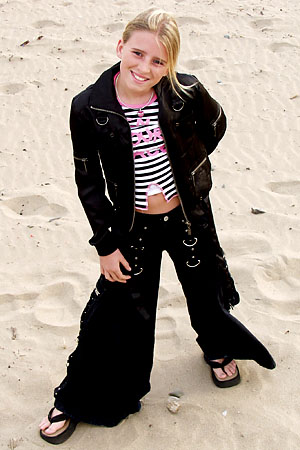
Close cropping for maximum effect
 |
|
 |
The picture on the left is a typical snapshot, two miles of coastline with a
pink blob in the middle. Turning the camera on its side and moving in a
little closer, as in the picture on the right, gives us a much better
picture of the girl and we can still see enough background to get the
message that we are on the beach.
For the sake of good layout on the page, I have made these two pictures the
same height. In fact they are the same size, if you can imagine them in
their original dimensions the girl is ten times bigger in the photo on the
right.
Even when you are shooting landscapes, you will find that, sometimes, the
picture will look more dynamic with an upright frame.
Always think, with every picture you take, should this be an upright or a
horizontal view? Usually the answer is obvious and dictated by the shape of
the composition but sometimes, for instance when the composition is square,
the best choice is not obvious. In this case take two pictures, one of each.
Can't I leave the cropping 'til later?
If you are printing your own pictures then you get a second chance to get
the cropping right but, don't rely on this to make up for sloppy camera
technique. If you crop your pictures afterwards in the computer or in the
darkroom, you are throwing away quality. You are wasting some of those
precious pixels that you paid so much for. What's the point in having a
camera with five million pixels if you are only going to use three million
of them?
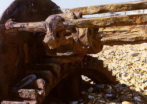
Cropping Example
| Here are three photos of a rusty old boat winch on Brighton beach.
Having decided to photograph it, I have to decide what I want to say.
Basically I want to say 'here's an interesting old bit of metal and it's
rusty'. In the top photo I have filled the frame with winch edge to edge
but does it really show the decay? We cannot really see the rust in
sufficient detail. |
|
 |
| In the second photo we can see much more decay and really see the
texture, which I think is the thing which attracted me to the object in
the first place. When we look with our eyes we tend to see details like
this and our brain filters out what is on the edge of our vision. When
composing we must be aware of the edges so we can tidy them up. |
|
 |
| Too close? Well that's up to you though it does have a certain
impact. There are no hard and fast rules, only suggestions. A walk
around the subject to look at it from different angles will always pay
dividends. Use the zoom to compose the tightest possible crop that still
shows everything you want. If you don't have a zoom lens then just get a
little closer. |
|
 |
Viewpoint
Selecting your viewpoint, the position from which you photograph the
subject, is a very important part of composition and one that some people
pay very little attention to. When taking a photo of a group of friends, how
often do you move around the group looking for the best angle?
The first, most obvious difference between one viewpoint and another is the
background. If you are photographing a subject that cannot easily be moved,
the only way to change what is in the background is to choose a different
viewpoint.
The subject itself can look quite different viewed from different angles.
Photos can be made to take on a whole new dynamic by selecting an extreme
angle of view. I shoot a lot of pictures, especially sports shots, laying
down, getting the camera as close to the ground as possible.
Also the perspective can change quite drastically, especially with wider
angled lenses. If you photograph a person full length with a wide angle lens
from a standing position, their head will be too big in proportion to the
rest of their body. If, on the other hand, you kneel down and shoot the same
picture from waist height, you will see that the whole picture is better
proportioned.
When shooting outdoors, the viewpoint you choose also affects how the light
from the sun falls on your subject. This is a whole new can of worms which
is fully discussed under lighting.
Here are a couple of examples exploring the effects of high and low angle
viewpoints.
 |
|
 |
Two full length shots from fairly extreme angles. A moderately wide angle
lens gives a certain amount of perspective distortion, the first shot in
particular makes her feet look very big in proportion to her head. This
distortion enhances the effect of the flared jeans and the big shoes,
whereas in the second shot the distortion of the shooting angle is working
against the effect of the big shoes and flares balancing the picture. If we
use a wider angled lens and shot from even closer, the distorted effect
would be even more pronounced.
In both cases you can see that the choice of angle has given us a nice plain
background as a bonus.
 |
|
 |
These two shots were taken from more or less the same position as the first
shot but, as we zoom in, the effect of the low angle is lessened. Less
distortion but a pleasing angle giving us a slightly 'larger than life' feel
to the picture.
When shooting against a bright sky like this you need to pay careful
attention to the exposure, the automatic metering system will render the
face too dark so you need to compensate for this. Take a few shots with the
exposure compensation at different settings or, better still, meter manually
taking a reading from close in to the face. The shot on the right metered
correctly because the face fills the frame more and is lit by the sun.
 |
|
 |
These two shots were taken from the same position as the top right and show
the same lessening of distortion as we zoom in. What I didn't bargain for
until I saw these two pictures side by side was that the apparent height of
the camera changes with the angle of the head. I think you'll agree that the
picture on the left appears to have been taken from a greater height than
the one on the right. Weird! |